kpyihe@gmail.com
400-103-1288


Selecting the right paint color for a Front Door is more than a design decision. It affects curb appeal, reflects personality, and can subtly influence the overall feel of a home’s entrance. A well-chosen color helps the door stand out, complements surrounding architectural elements, and enhances the impression visitors get before stepping inside. This guide explains the key considerations and practical steps to choosing a front-door color that aligns with both style and long-term durability.
The first step is to look closely at the home’s existing color palette. Exterior walls, trim, roofing material, and landscaping all influence how a door color will appear. A neutral façade such as beige, off-white, or gray offers wide flexibility because bold shades like navy, red, or forest green naturally stand out. On the other hand, darker façades may benefit from brighter tones that create contrast. Traditional homes often pair well with deeper classic tones, while modern structures tend to look appealing with monochromatic or minimalist hues. Taking a few steps back from the house helps visualize how different colors interact with the larger structure.
Front doors receive varying levels of light during different times of the day. Sunlight can brighten lighter tones but may wash out softer shades. In shaded entryways, deeper pigments often appear more stable and rich. Artificial lighting near the door, such as side lamps or overhead fixtures, can also change the appearance. Observing paint samples at different times—morning, afternoon, and evening—helps ensure that the chosen color remains consistent. Since a front door is a focal point, maintaining a shade that remains visually stable throughout the day enhances its appeal.
Architectural elements such as columns, stone veneers, metal hardware, and window frames can either complement or clash with certain shades. For instance, bronze or black door hardware tends to pair well with blues, greens, and charcoal tones. Brushed nickel hardware usually looks harmonious with whites, pastels, and cool grays. A useful method is to place a small painted board near hinges, handles, and decorative trims to see how the hue interacts with these materials. Shapes and lines on the door—panels, glass inserts, and decorative grooves—may also appear more defined with contrasting colors.
Some color families consistently perform well on front doors due to their balance of character and versatility. Neutrals such as black, gray, and taupe provide a timeless appearance suitable for most architectural forms. Blue tones create a calm and welcoming entrance, while red introduces a strong traditional look. Green shades connect the entrance with surrounding plants or trees. Warm yellows and muted golds can brighten shaded porches. When deciding among these categories, homeowners often select two or three shortlisted colors and compare them directly on the door surface to see which better suits the home’s overall atmosphere.
| Color Group | Visual Effect | Best For |
|---|---|---|
| Black / Charcoal | Strong contrast, modern appeal | Light façades, metal hardware |
| Red / Burgundy | Classic and bold | Traditional homes |
| Blue / Navy | Clean and calm | Coastal, contemporary styles |
| Green / Olive | Natural and balanced | Homes with rich landscaping |
| Yellow / Gold | Bright and uplifting | Shaded porches |
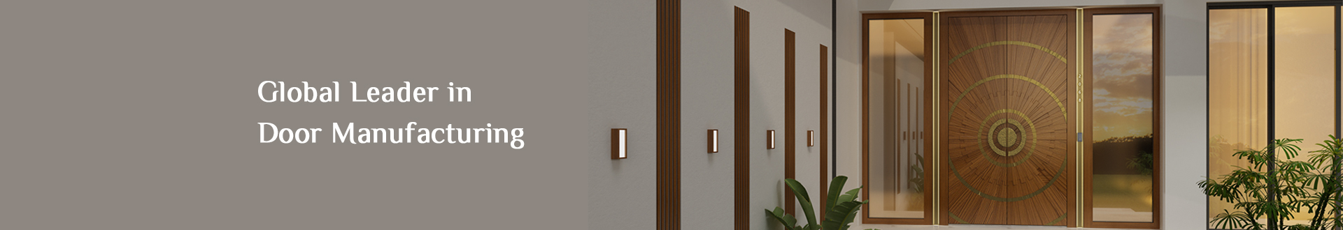
Besides visual style, the finish influences how the door looks over time. Gloss finishes provide a polished appearance and highlight decorative door shapes, while semi-gloss and satin options offer a more subtle look with easier maintenance. Darker shades may absorb more heat, which can accelerate fading on south-facing entries. Lighter shades reflect sunlight better and stay vibrant for longer under harsh conditions. High-quality exterior paints minimize peeling and cracking, and doors made with precision craftsmanship—such as those offered by ARTY from yihedoor.com—provide a stable base that helps the finish remain durable for years.
The entrance area often includes railings, plants, porch flooring, and lighting fixtures. These elements should feel cohesive with the chosen color rather than competing visually. Wooden porches may look best with earthy tones, while concrete or tile flooring pairs well with modern cool hues. Exterior plants and seasonal decorations can also influence the perception of color. A shade that harmonizes with both summer greens and winter neutrals ensures the door maintains a consistent appeal throughout the year.
Testing is crucial because small swatches on paper rarely match the appearance on the actual door. Applying test patches on various sections of the door—top, center, and bottom—helps evaluate coverage and undertone differences. Shadows cast by porch roofs and side walls can change the appearance of the color, so evaluating these patches under different weather and lighting conditions ensures the final choice remains stable. Observing the color from across the street also provides insight into curb appeal.
Choosing the right front-door paint color involves balancing aesthetics, architectural context, lighting, material compatibility, and long-term durability. By comparing color families, understanding how finishes behave, and testing real-time samples, homeowners can select a shade that enhances both the appearance and value of the property. Investing in a well-crafted door, such as those produced by ARTY, further improves the final result by ensuring the paint adheres smoothly and remains attractive over time.
Previous: How Much to Install a Front Door?